Four Assessment Drawings
Hand
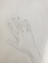
This is my drawing of my hand, I was told to draw my hand from looking at it. This was kind of hard for me, I'm not good at drawing in details. Realistic drawings aren't my specialty. I am going to keep learning on and working on detailing. |
Portrait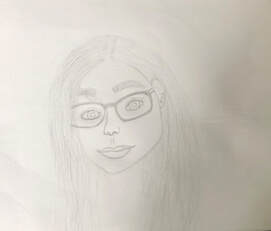
This is my portrait, this is my first time actually doing a portrait. I plan to continue to work on improving facial features and details.
|
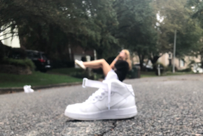
Air Force 1's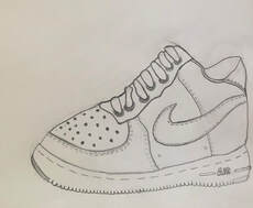
This is my shoe drawing, I sketched a Air Force 1. I decided to draw this shoe because this is almost the only shoe i wear. Virtual school |
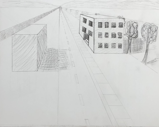
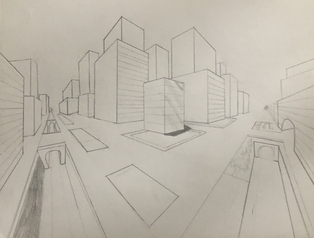
1 point perspective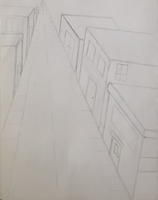
This is my 1 point perspective of the street. If I were to do this again I would come at a different angle than I did and make all of my lines darker. |
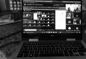
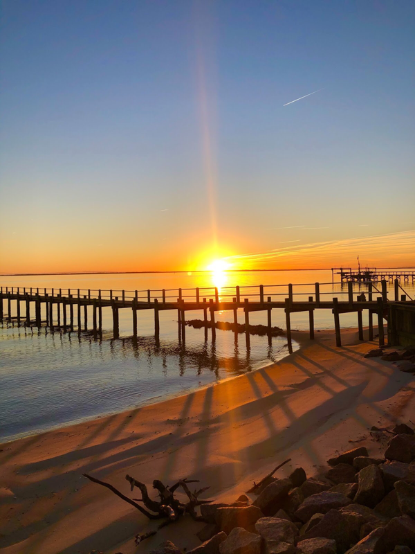
This is my main picture, since Covid we are having to do
virtual school. It's very different then all of my other yeas of school. I think I think i like more because it has been easier for me and the classes or shorter. I put this photo in black and white so u can see the value and movement it adds to the picture. |
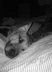
Since we have had shorter
days for school i sleep a lot and i make my dog come take naps with me. |
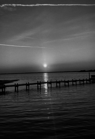
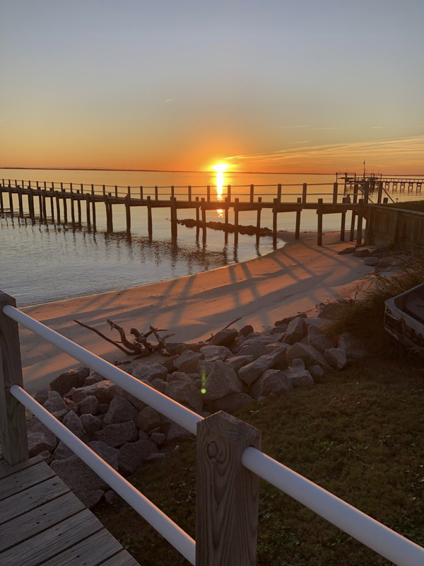
Since we haven't had school and
with school being online iv'e
been traveling a lot. I really like this
photo in black and white and the
volume that it gives.
with school being online iv'e
been traveling a lot. I really like this
photo in black and white and the
volume that it gives.
Contour Drawings
|
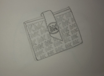
This is one of my contour drawings, I did this one in pencil. I actually like this drawing This is my MK wallet.
|
|
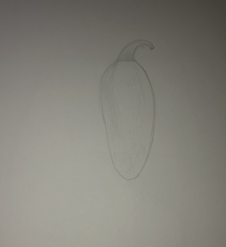
This is my other contour drawing that I did in pencil. This one I did of a jalapeno
|
This is one of my contour drawings that is did in pen, I personally do not like drawing in pen because I like to erase a lot.
|
|
Real vs. Man Made
This is my man made drawing that
that I did in pen, I find it hard to draw in pen it doesn't look as good to me. |
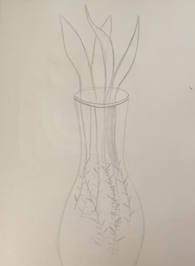
This is my nature drawing in pencil. I drew a aloe plant that we had in our house.
|
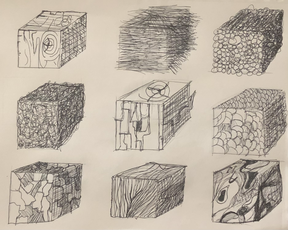
Shading shapes
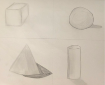
This are my shaded objects, I still need to work on shading.
I do not find it easy to shade so i plan to keep practicing on
my shading.
I do not find it easy to shade so i plan to keep practicing on
my shading.
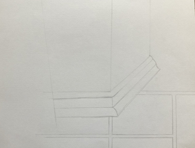
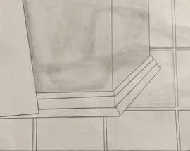
Three contour drawings
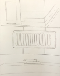
These are my three contour drawings,
I drew an air vent, window latch, and the
corner of my wall. The wall was kind of
hard for me to draw, I couldn't get the
perspective right.
I drew an air vent, window latch, and the
corner of my wall. The wall was kind of
hard for me to draw, I couldn't get the
perspective right.
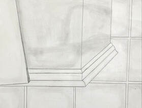
Final Unseen Drawing
|
|
|
These are my final unseen contour drawings, for this assignment we had to look around and notice things that normally go unseen or objects that aren't the biggest focus in the room. I chose to do the corner of my wall. My Process is being shown through my photos, first I sketched out what I was going to do, then I was getting a better idea and started adding some shading and outlining, finally is my final drawing where I added all of my shading and brought it all together. I found the value in the object by looking at where the sun was hitting the wall and tried to show that. I tried to achieve the values I don't think I was successful I think I could have gone darker with them. This is executed neatly, you can understand what this is. It is important to know how to shade before you do this project, it is an important piece in this. I don't this I really grew or learned anything from doing this project. Some obstacles was never being taught how to shade or show value in drawing, none of this was taught well in my opinion.
Pen Techniques
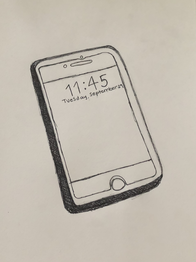
For this assignment we had to draw an
object in pen using the techniques that
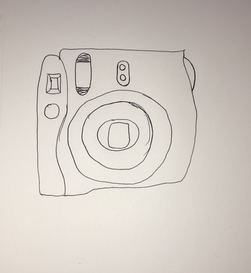
we learned. I chose to draw my phone
this was kind of hard with the object I
chose not being able to add more value
I feel like.
object in pen using the techniques that
we learned. I chose to draw my phone
this was kind of hard with the object I
chose not being able to add more value
I feel like.
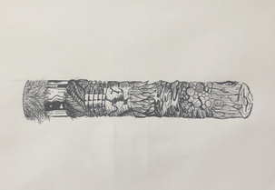
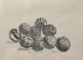
This is one of my pen and ink drawings. I think this one came out really good. for these three drawings we had to watch three videos and complete what the artist was doing and try and use those techniques. |
This is another one of the ink drawings where we watched the artist draw. If I was to do this again I would draw my cubes over, I don't think I was able to keep the shape of the cube. |
This one we had to draw the
circles he was drawing, this
was actually easier than I
thought it was going to be.
I would definitely say this
one took more time and
consistently know what
to do to keep the shape
right.
circles he was drawing, this
was actually easier than I
thought it was going to be.
I would definitely say this
one took more time and
consistently know what
to do to keep the shape
right.
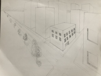
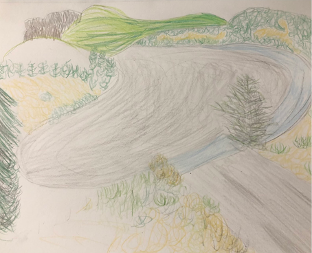
Perspective Drawings
|
1 point
For the perspective drawings we were assigned to watch two videos and try and do what the artist in the video was doing. I think the perspective is okay I've only done two before I would have gone in with a darker shade. 2 Point
|
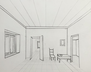
This is a perspective of a room. I don't know how I feel about this, a lot of my lines aren't straight and coming from the vanishing point. |
|
|
These are my 2 point perspective drawings from the videos. This was my first time doing 2 point, these are both city perspectives. If I were to do these again I would add more detail and shading.
|
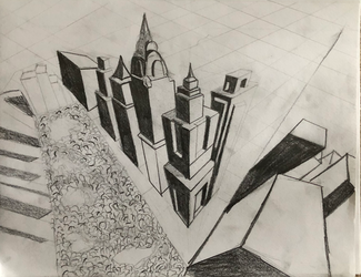
3 Point
|
|
These are my 3 point perspective drawings from the 2 videos. There is a worms eye and birds eye view. The birds eye was really challenging from me. I prefer the worms eye although I would add more in the background.
|
Forced perspective
This is my forced perspective photo, forced
perspective is taken at an angle to give off
an illusion. For this assignment we had to
take multiple perspective pictures and
choice which one we liked the most. In this
perspective I tried to make it look like I was
sitting in the shoe. If I were to do this
assignment again I would face the other way,
to look more real.
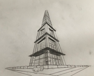
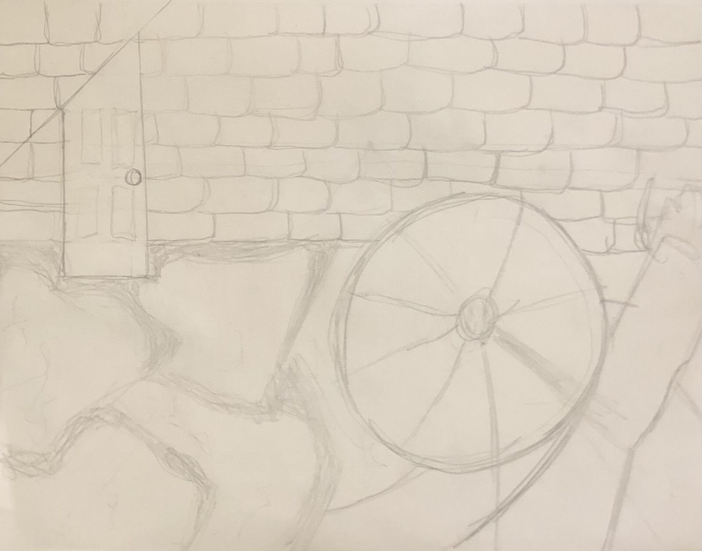
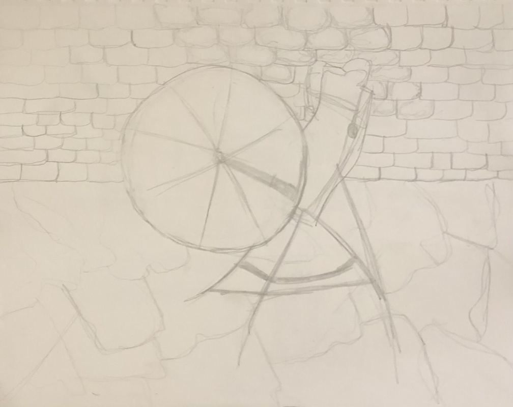
Pen Perspective
Brainstorming ideas
- Rapunzel's tower in worms eye view
- The ugly duckling- half duck half swan
- Needle and the wheel- wheel in a dark brick room
- Three little pigs- wolf's mouth is the door, pigs walking in
Compositional sketches
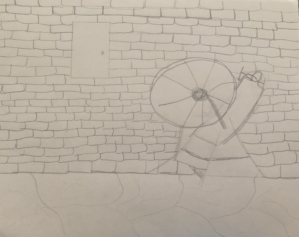
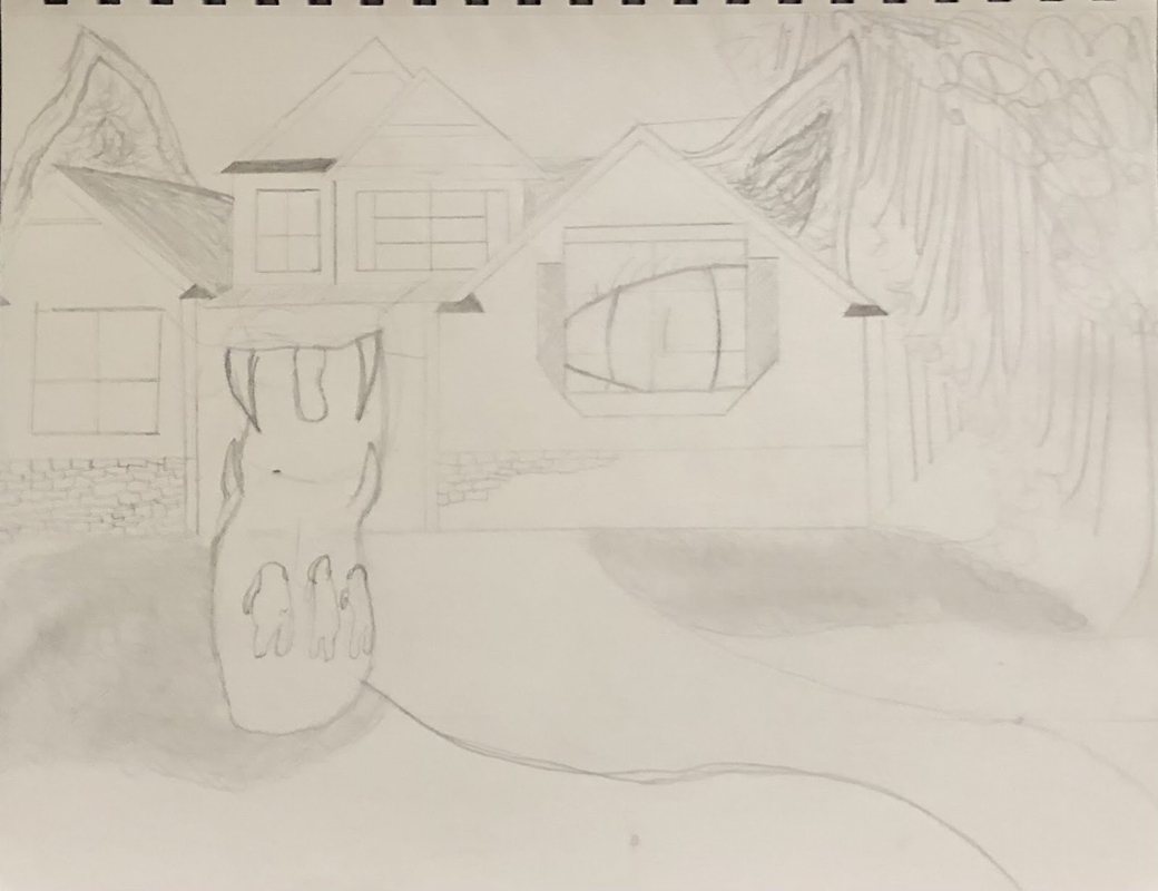
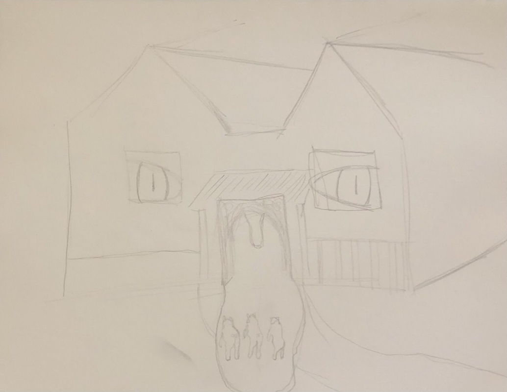
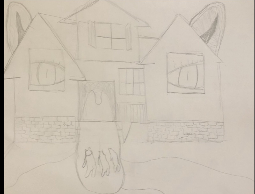
Final Sketch
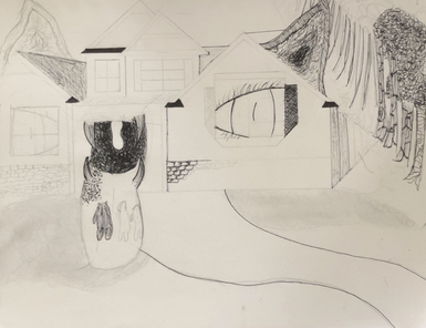
Final drawing
Self Reflection
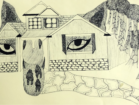
- I used stippling in some parts on my art to show/give off the texture of the trees, tongue, and ears. I use scribbling around the eyes and on the ears to try and recreate a fur texture. I uses hatching on the base of the house so it wouldn't be a blank space their.
- I tried to use one point perspective to angle the house and get the house to look realistic, perspective was important in my drawing so the picture has value and it's not flat.
- Texture is important in my drawing to give off more detailing in every feature.
- value is important in this project to give off the depth of the object and to look realistic.
- I think I definitely could have done better and maybe could have practiced pen technique's more.
- I would change out I did the leaves on the trees, add more/different value to the ears, spend more time on the three little pigs.
- I recreated the Three Little Pigs, I represented the story by showing the strongest house out of the three pigs. Inside the house is the wolf's mouth at the front door waiting for the pigs to walk right in.
- It is important to know what they are used for and when/how to properly use the technique's
- As a growing artist I think some of what I have learned can help me progress into becoming a better artist.
Colored pencil forms
|
|
|
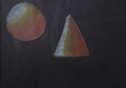
|
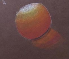
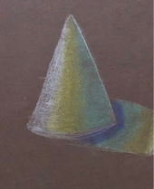
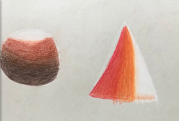
These are my colored pencil forms, the assignment was to use the brown, white, and black paper and draw a circle and a sphere on each with blending. I didn't do so good with the blending the color pencils I was using wouldn't blend very well. If I was more into using colored pencils I would definitely use a better brand.
Colored pencil fruit/veggie
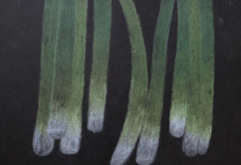
This is my colored pencil veggie. I choose to do green onions mostly because I thought it would be easy for ability of color pencils, turns out it was not easy. I tried to have the onions stacked on top of each other in some areas, that didn't workout well for me, they started to blend in to each other, I kept trying to add more layers but they weren't showing up after a few layers.
Water color value chart and forms
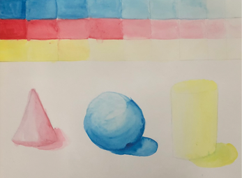
This is my value chart, the assignment was to use red, yellow, and blue and make a value chart and shade the three forms. This was my first time using watercolors, I think I did this pretty well it is a little messy.
Watercolor peppers
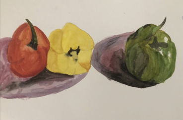
For this assignment I chose to do peppers, this was a little tricky for me, at first everything just started to blend together and I needed to wait more time for it to dry and then come back and fix it. For watercolors you need to be really patient and I'm not that. Overall I would say I did good for never using water colors other than from when I was little.
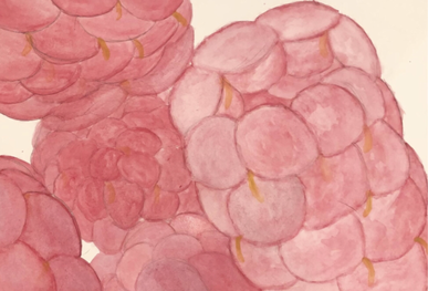
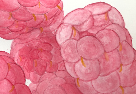
O'Keeffe inspired painting
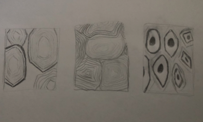
Brainstorming ideas
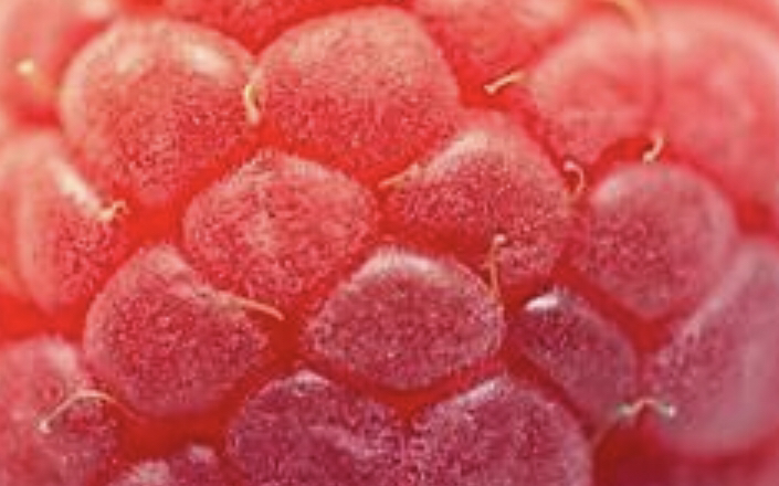
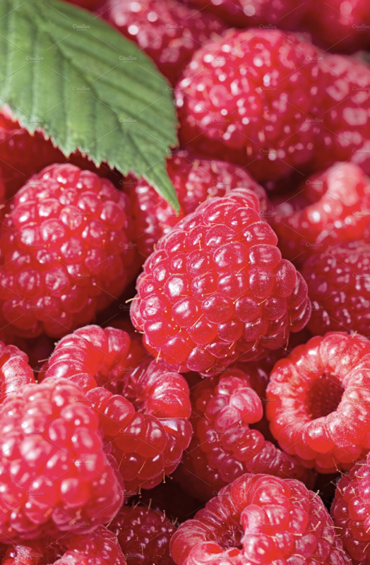
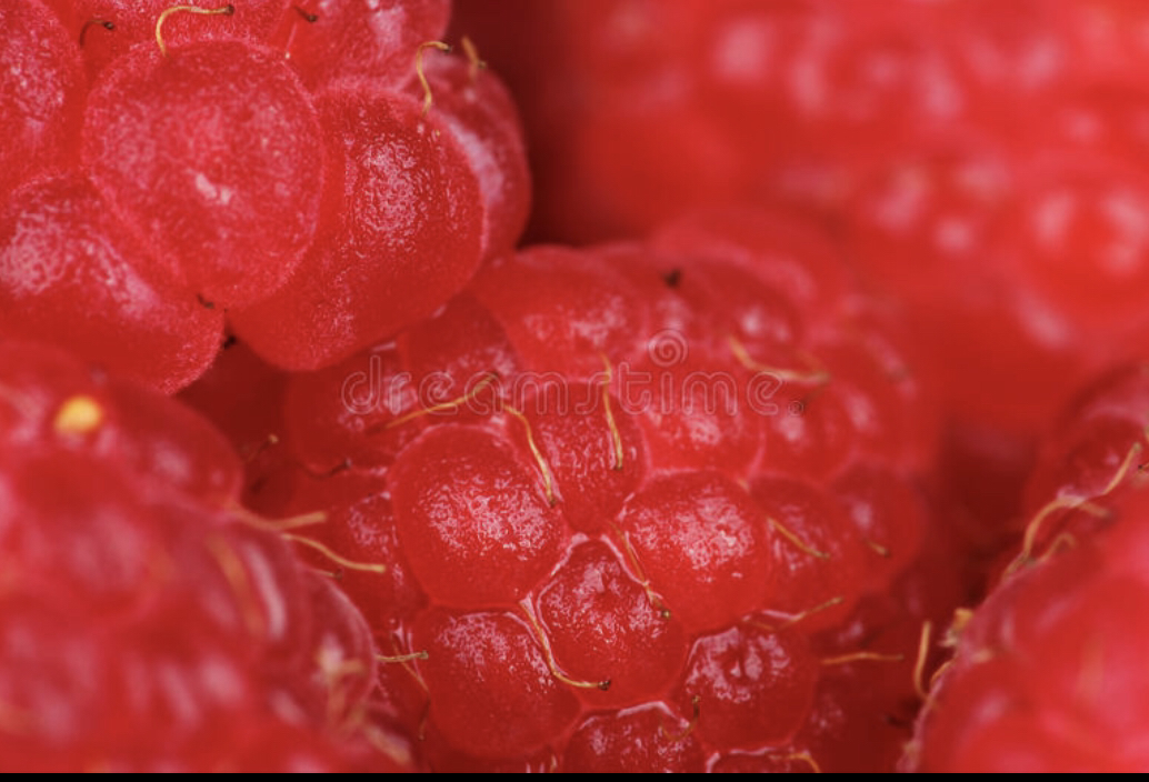
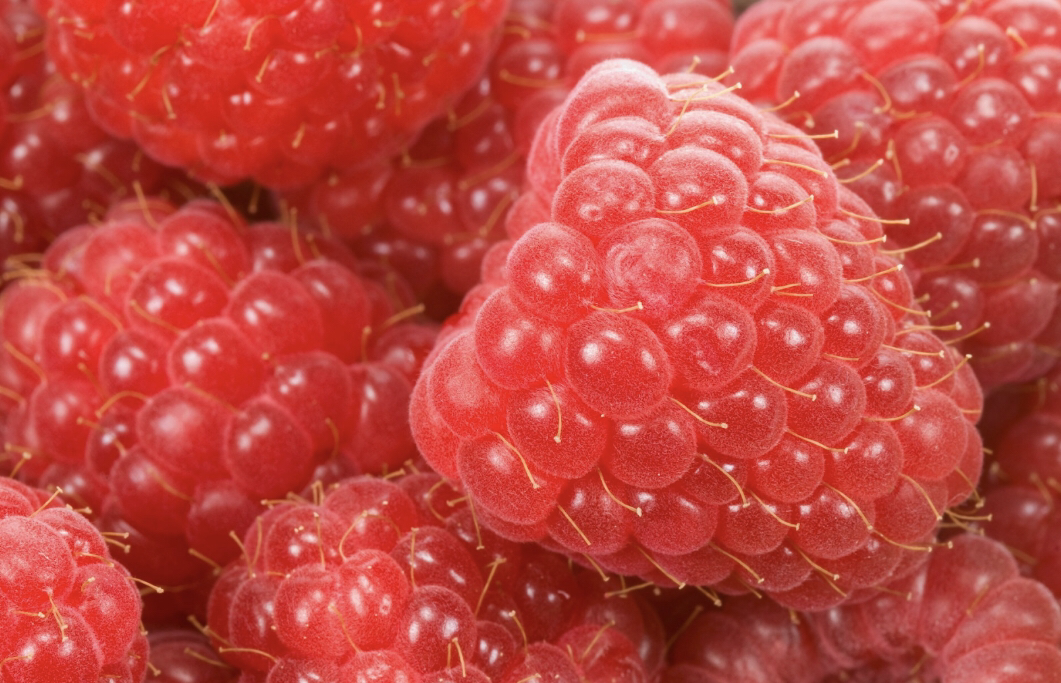
- close up of jalapeño seeds
- close up raspberry
- pomegranate seeds
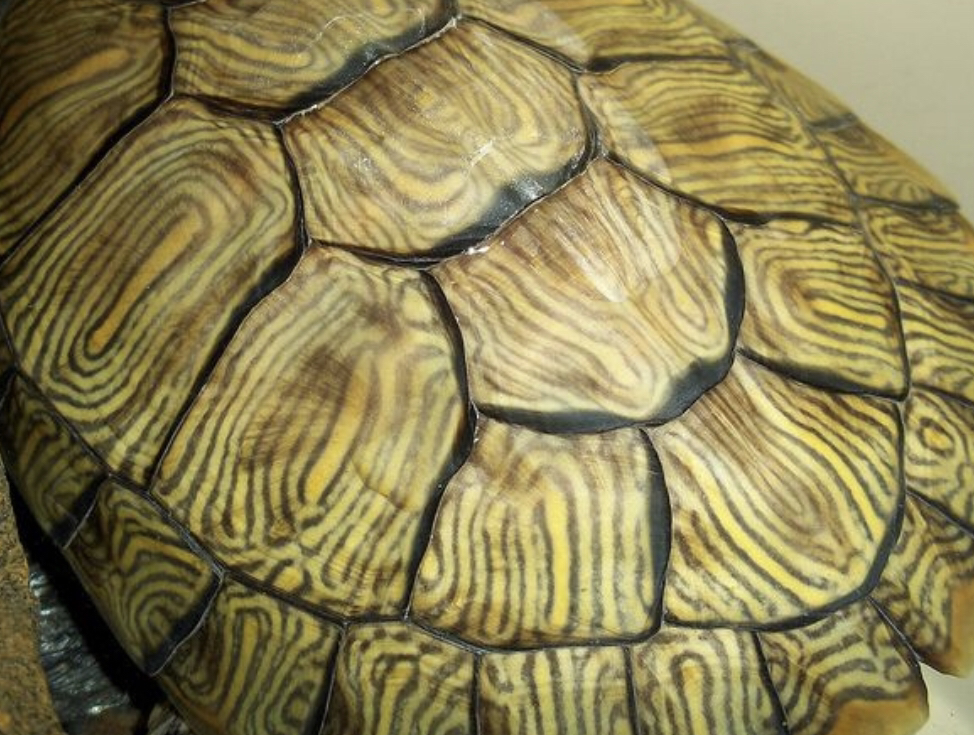
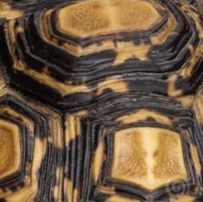
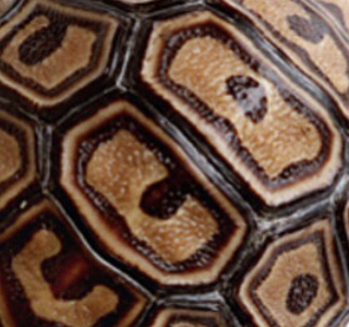
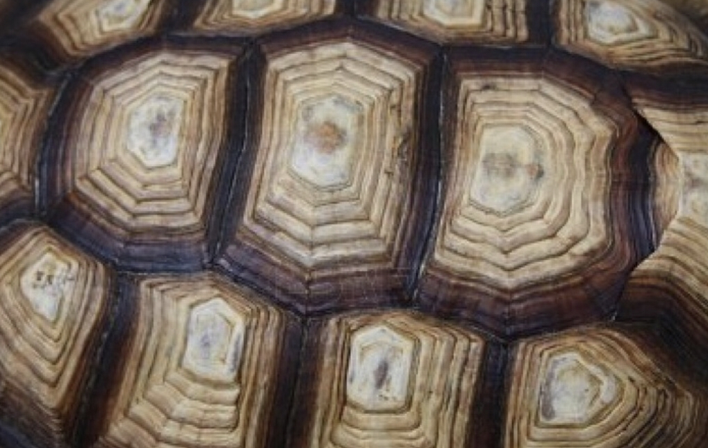
- close up of turtle shell
- Butterfly wing
Reference photos
Compositional sketches
|
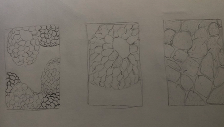
|
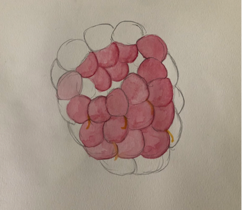
In-progress
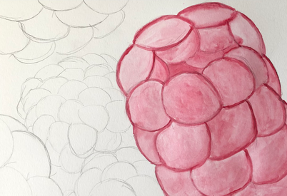
Final
|
|
|
Self Reflection
- I think the technique that ended up working out best for me was wet on dry. I think this worked best for when I had to layer the paints and try to make them darker each time.
- I didn't use any color pencil in my drawing I didn't know this till I was done.
- I was able to get the effect of the raspberry being up close, and the color down on most berry's.
- Color choice was really important in mine, I used red as my main color to try and match the actual color.
- My knowledge was knowing that O'Keeffe paintings where focusing on the object and detailing from up close, not the whole object.
- Watercolors is not my "skill" I've never done any big projects with watercolors.
- If I where an art critic I would not give myself very good feed back.
- If I where to do something different I would use color pencil to make the color darker and try and use more colors to make it more realistic.
- I have learned that watercolor is harder than it seems and frustrating sometimes and you need to be really patient. I have also learned it is easier to cover up your mistakes with watercolors. I don't think I really plan on using watercolors in the future.
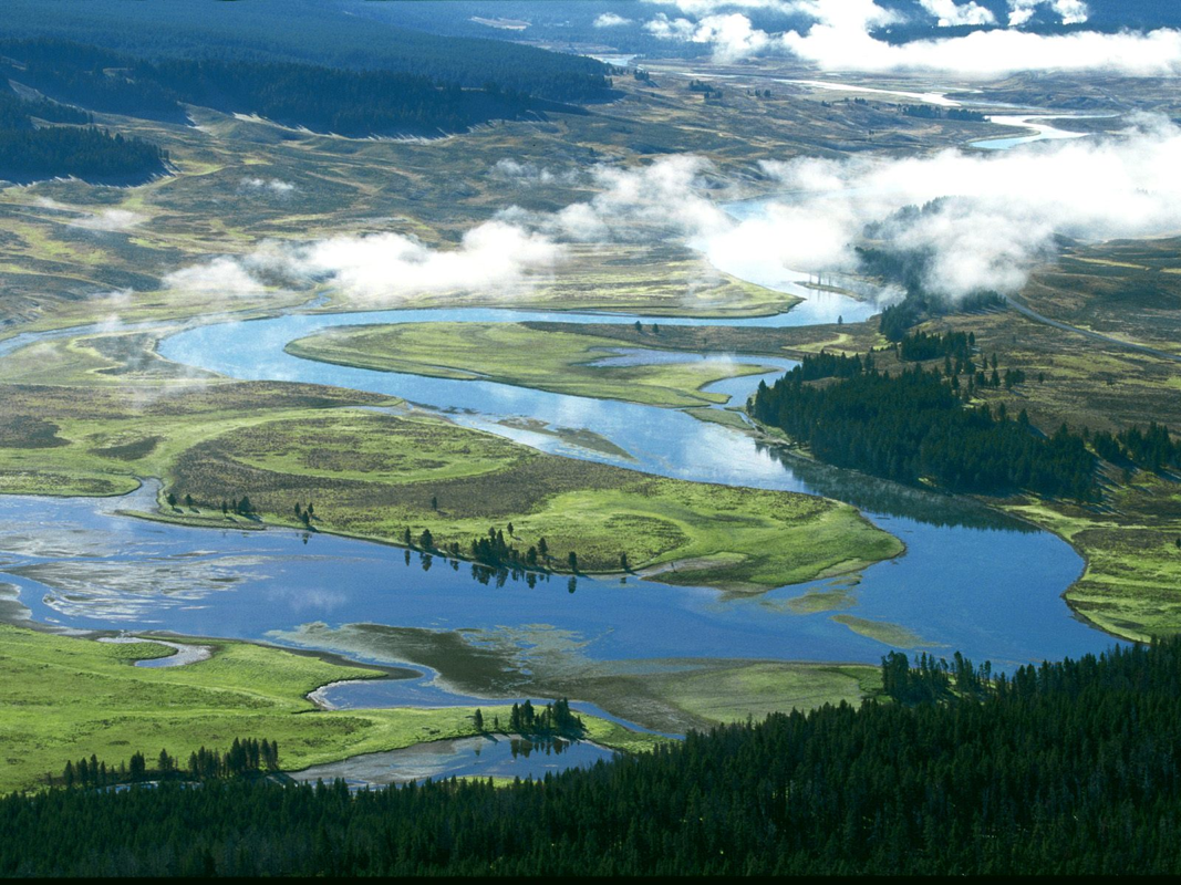
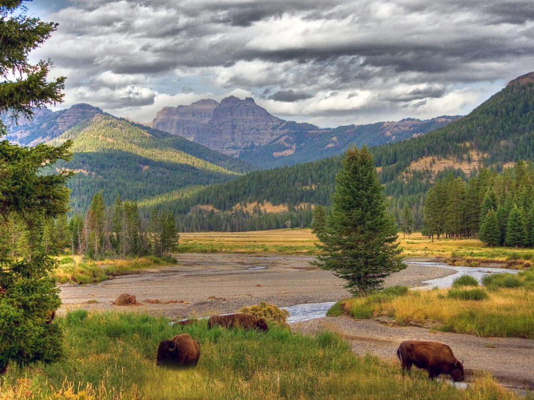
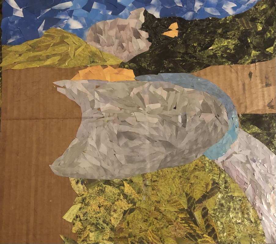
Collage
Brainstorm Ideas
- Harker's Island
- Raleigh Park
- Yellow stone national park
- Zion national park
- Yoho national park
Reference photos

Compositional sketch
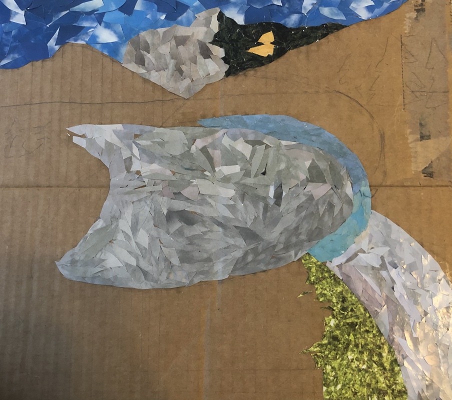
In-Progress
Final
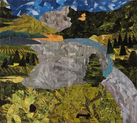
Self-Reflection
- I chose to do Yellowstone park for this project because it was a pretty picture and seemed interesting. When you look at the composition up close you can't completely tell what's going on but when u step back you can see what's going on.
- The accuracy of my proportions are almost there, I could do some work on the trees, but for my first time blindly going into colleges I think it's pretty good.
- I tried to at texture to my piece by using cut outs that already have texture to them to bring volume to the picture.
- I just looked in the magazine until I found something I thought could work for the texture, I didn't really do any specific shapes I just cut the magazine into small pieces.
- I think I used a good range of values in this piece. I attempted to use background by placing the paper up higher on the cardboard, foreground by placing pieces on the bottom and middle ground by observing the reference photo and seeing what goes in the middle and trying to recreate that.
- I think the artwork is neatly created, this is a time consuming project and takes quite some patience.
- If I were to redo this project I would find a better way to make the trees look more realistic, I was struggling with the trees I couldn't find a way that worked good.
